↧
smoke break...
↧
CTN-X and Ze Idiot
One thing I've learned is life never slows down until you really make an effort to step on the brakes. I apparently do not know how to let go of the gas pedal.
But when I do have some free time, I try to have fun and still paint for myself. Another painting I did over the amazing Christophe's line work. Please visit his booth during CTN-X and he'll tell you more about this exciting project. Maybe I'll be there.
↧
↧
ze idiot sketch...
↧
Rise of the Guardians
I believe Rise of the Guardians is one of the best film DreamWorks Animation has ever released. Something so magical in childhood which have been lost in most PG rated movies today, but was restored in this holiday movie. And what makes this movie even more special are the movie makers behind the screen. Peter Ramsey, Patrick Hanenberger, Max Boas, Jayee Borcar, Woonyoung Jung, Perry Maple, Peter Maynez, Stan Seo, and everyone else in every department poured so much heart into this project and it really followed through. These are the people who are the new generation of film makers... talented in their own special way. Congratulations to all the Guardians team for creating such an epic and beautiful film!!!
Fortunately, I had the opportunity to work on the film for a short period of time two years ago. I was brought on to paint what we call "story beats" which is pretty much a painted storyboard. We use these story beats to pitch the film to our CEO to give him a "feel" of the movie, before he gives the okay to move forward and create models, animate, layout, etc. These story beats are not color keys, production paintings, or visual development paintings. They are only used very early in the production pipeline after it has been green lit. In short, not everyone can visualize the entire movie the way the director or production designer can through just the script, so they have people like me take existing characters and pose them in pretty paintings for our executives.
Anyways, here are two paintings. More to come. These are really old so be nice on the comments ;)
↧
few more ROTG story beats
↧
↧
kitty snow flake!
↧
Happy Holidays from the Croods!
↧
Happy 2013!
With everything that will be happening in 2013, it's already going to be an extraordinary year!!! I will be picking up the pace on my personal work again so be on the look out for new artwork! The past two years have been focused much too often on my job at DreamWorks Animation as well as a heavy amount of freelance, but I am making an effort to start going out to conventions and providing available prints and originals for sale! That can only mean I have to start producing more work!
The first part of my year will be focused a lot of "Ze Idiot" with Christophe Lautrette and Tigobo Animation. We will be doing a two day workshop in Angouleme, France during April (I will have a detailed post about this and Tigobo later) along with master professionals of the animation industry.
I also want to begin showing step by step processes of some of my work. I always get caught up in the moment of an illustration and forget to take pictures or save a jpeg along the way, but hopefully I'll keep this in mind next time!
Something about this year feels really good. Thank you everyone for continuously dropping by my blog! I will also be preparing some giveaways this year to show all my appreciation!
↧
Tigobo Animation
Throughout my short period of time in the animation industry, I have received an abundance of emails asking crucial questions about this career.
"What's the best school to go to for Animation?"
"What do I include in my portfolio?"
"What classes should I take for visual devleopment?"
...and so on.
I've always done my best to share my experiences and what I feel would help. One of my key suggestion have always been to NETWORK. Find opportunities to where you are be able to meet professionals either though conventions, mutual friends, or (in this particular case) school.
Through working with Christophe Lautrette, I was fortunate enough to be introduced to Reno and Flavie (the directors) of Tigobo Animation School. This is no ordinary school though. Because Tigobo Animation is originally a production company, they hold workshops where professionals come in and help develop student's existing personal projects. While in the workshop, not only do you learn from what the instructors are teaching, but also get to know them in a more personal level. And for some time, these courses have only been in France and online, but recently the list of instructors have expanded and they are now offering classes here in Los Angeles!
Ultimately, what you get out of the workshop is a wider understanding of what is needed in developing a project for animation. Your own work will improve with stronger content, design, and clarity. You can then either submit your portfolio for a job (already revised with professionals), continue developing enough content to pitch to major studios, or even gather a team and create a short yourself!
For more information, please visit their website: tigoboschool.com
Come back soon! I'll be posting up a process of a recent painting I just finished of "Ze Idiot"!
↧
↧
a quick step by step
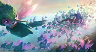
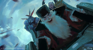
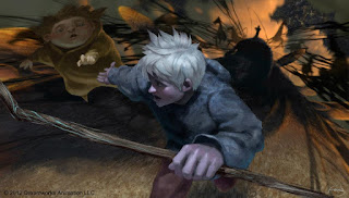
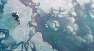
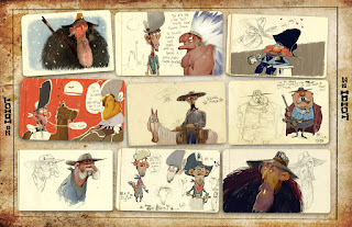
Thought you all might like to see a process of how I make an illustration. My steps aren't always the same, but it shares some of the same foundations I was taught at school. This is all done on a cintiq, but can be applied traditionally as well.
The first step I just loosely doodle in my character and a cloud shape. The concept was already made up in my mind so this was just me scribbling down the idea.
Next, I start cleaning up the drawing and really figuring out the form. I was playing with thick and thin lines a lot since I had the idea of keeping the line drawing until the end, but you'll see I changed my mind (which I tend to do a lot).
Loosely block in some colors, some more shapes for the background and making a decision for negative/positive shapes and detail/simplicity.
At this point I said screw it to the line work and started cleaning up the painting on the character. Also thinking less about a light direction that makes sense, but more about simplifying shadow shapes and light shapes.
During this moment I really changed somethings up. I didn't like the bigger shape language of the character and wanted to push the gesture more. Just by exaggerating the hat and adding the leash helped with the general flow of the character. I also began cleaning up some of the edges in the bg playing with settle brush textures.
I continued to doodle on the bg to balance out with the detail on the character. **NOTE: Usually you want to keep the background loose and focus on your character or focal point. But for my particular illustration, a large portion of the bg was too simple and I felt it needed some visual noise for balance.**
And finally, finished off with a little more noodling on the character. Laid in a texture and added a bit more gradation. Not 100% sure if I'm done, but it's good for now.
Hope you guys enjoyed the write up! There will be some in the future that will tackle on a more rendered look (like what I do at DreamWorks), but the foundations are usually the same.
↧
quick and dirtaaayyy
↧
Happy Valentines Day!
I wish I had a moment to paint my own Valentines illustration this year, but just a bit too preoccupied with work and Ze Idiot.
So several weeks ago I was asked to paint seven different themes of "Now and Then" illustrations for "The Croods". Our marketing team was going to release them as the holidays for the specific themes came up or a few each month until the release of the movie on March 22nd. The original character designs were done by Joe Moshier and the final look design was created by Margaret Wuller. You can find more updates on the Croods if you follow their facebook page. Thanks for stopping by!
https://www.facebook.com/home.php#!/TheCroods?fref=ts
↧
news news news!
A few new things to share with everyone!
First off, we had our Croods Wrap Party last week and it was the first time I had seen the completed movie since I rolled off last year. It's not fair for me to judge the movie since I am very proud to have been a part of it, but I do think it is THE most visually stunning animated movie ever... EVER. Only 3 more weeks before it releases!
In an earlier post, I think I mentioned about the conference/workshop I will be doing with Christophe Lautrette and many other talented artist in Angouleme, France.
http://www.tigoboanimation.com/meetZEartists.html
Tigobo Animation is doing a wonderful job setting this up! Tigobo will also be having their yearly workshop here in LA during the summer so take a look at their website for more info.
http://www.tigoboanimation.com/tigobo-school.html
Here are some teaser images of the collaboration Christophe and I have been doing. We are prepping for our presentation so there has been A LOT of these sort of pages. Only a little over a month to go! No idea is locked down yet, so he's been exploring a lot on the characters while I've been playing around with different types of color palettes and finishes.
And finally, today will be my first day on a new production. I will be joining the fearless, masterful, PURE AWESOMENESS of the "Kung Fu Panda 3" team. Release date 2016. Sorry, that's all the detail I can share :) Thanks for stopping by!
↧
↧
the first of many... (croods art collection)
I hope everyone is ready to fill up the theaters this weekend for the opening of The Croods! For a fun and entertaining time, watch it in 3D (it's exceptionally good)!
As much as I would love to dump all two years of my Crood's artwork on this blog and get it over with, I still want to keep up with my personal work and share with you all the magic that happens after hours (although I can hardly call it magic).
Anyways, so here is the first official release of one of my pieces from The Croods! You wouldn't believe how many different iterations of the first jungle sequence we went through. Over and over... months after months. It finally took one key idea of having the jungle feel underwater that inspired our final designs.
I think our production designer (Christophe Lautrette) knew that I loved painting in candy-colored mess. He allowed me to visualize what colors we might expect in this world. I did a few different paintings, but ended up choosing this one since we felt it successfully represented OUR jungle This is by far my most favorite piece of artwork I did on The Croods... even if it is two years old now... time sure does fly...
Here's is a simple step by step. I started immediately with just pops of color and painting very loosely. Painting in flat shapes helps me structure my value properly.
From here, I start throwing in photo textures and refining shapes, but still keeping within my original composition, value, and color.
Next will just be the final touches. Strange how long final touches usually take for me (since I'm so bad at making up my mind). Adjusting the lighting, pushing and pulling light and dark objects, and simplifying areas that I feel are too busy. This is also where I will spend some time adding in characters for storytelling. I always feel characters should be included in a painting not just for scale, but for telling a story. It sometime feels like a waste of time since this is an environment piece, but it's going that 1/8 of an inch or that 110% that I'd like to add.
And a version the directors wanted with our dandelion critters.
Thanks for stopping by! More to come! Go check out the movie!!!
↧
time for a story
Like most people, I was very surprised when I found out I would be spending the summer as an art intern at DreamWorks Animation working on the next Chris Sanders and Kirk DeMicco movie, "The Croods". Little did I know, the team consisted of some of THE most talented artist at DreamWorks... maybe even the industry! What could they possibly need me for?! As I sat in my cube, painting a surfacing call-out on a piece of fur cloth, I started to analyze where I may be able to find the opportunity to show what I can offer. We had HUNDREDS of environment paintings and each day everyone was cranking out more and more. I began to notice we didn't have any simple moments of just closeups of our characters. So I decided to do a quick painting on my own time to see how our characters could be lit in a realistic setting. What started out as just an exercise for myself, caught the eye of our production designer, Christophe Lautrette. And I was very lucky to have Christophe like it enough to bring it up in our meeting with the directors and producers. They loved it. And immediately after that meeting, I was given much larger responsibilities and more important assignments (but still a lot of fur call outs that need to be done). I am not 100%, but I have a feeling this is one of the few paintings that really helped me become full time at the studio.
Here's another process of how this paintings came to be. Thanks for stopping by!
By the way, there are A LOT of unpublished Croods art going around the web now that the movie is out. Take a look at Leighton Hickman, Simon Rodgers, Jason Scheier , and Nicolas Weis. These guys are SO IMPRESSIVE! Now you know how terrified I was coming onto the movie with these types of talent!
↧
more croods...
For all the locals... we have a book signing event this weekend (April 6th) at Gallery Nucleus with the art team of The Croods! There will be a panel where we discuss our process and inspirations, Q & A, and some book signing time! Here is the link to the event for more info!
http://www.gallerynucleus.com/event/386
The "BearOwl" was one of the first characters I designed the colors and patterns for. I'm very happy to see the amount of screen time he (or she) ended up getting in the final movie. Character designed by the amazing Takao Noguchi.
One of many shots that we were certain was going to make the final cut... but ran out of time (or money). Although I really REALLY love how that environment ended up looking in the movie.
A collaboration painting between myself and Leighton Hickman.
Another family moment. Painted this from Ryan O'Loughlin's storyboard. Such a talented and sweet guy. He is now co-directing one of our upcoming animated films. Congratulations, Ryan! Well deserved!
↧
hunting for dinner!
Here is a painting I hacked together with multiple assets from all sorts of different paintings. There were a few times on The Croods when it was necessary to grab paintings other artists had previously done on the movie because we were so crunched on time. Someone might have done the layout, someone else painted the environment, someone else painted the characters, and then someone else painted all over and the only thing left was a tree.
Anyways, this was definitely one of those paintings. Our art director, Paul Duncan, roughly laid in a layout with the painted turkeyfish he took from a Dominique Louis painting. There was an old Huy Nguyen painting where Huy designed these cool pillar shapes, and I took those pillars and shifted the colors to match the environment. And then the rest was just rendering, adjusting the lighting, and painting in the family.
TEAM HIGH FIVE!
↧
↧
round 4 of the croods...
↧
go fetch a tree!
↧
croods dump round 79457935983785
↧